
A concept redesign that energizes the Dutch Bros app by enhancing navigation, elevating rewards visibility, and creating a more vibrant, community-driven experience.
Overview
Dutch Bros has built a loyal community through its colorful drinks, upbeat energy, and friendly drive-thru culture — but its app doesn’t fully reflect that personality. This concept project explores how brand identity and user experience can work together to create a more engaging, intuitive ordering flow. My goal was to study the current app, identify usability and communication gaps, and visualize how a refreshed interface could feel more exciting, trustworthy, and on-brand.
Project Duration:
1 week (Concept Project)
My Role:
UX/UI Designer
Tools used: Figma, Zoom, FigJam
Discovery
The Problem
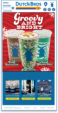
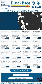
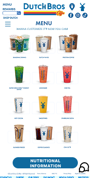
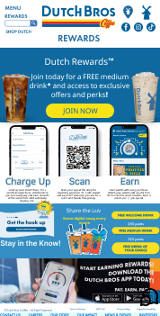
Users find the Dutch Bros app visually dated and sometimes confusing to navigate.
The design doesn’t match the company’s fun, social, and high-energy vibe, and core functions like rewards tracking and quick re-ordering are buried in menus. This disconnect between brand personality and interface design reduces emotional connection and loyalty.
The Solution
I redesigned the Dutch Bros mobile experience to better reflect the brand’s energetic and community-driven identity. The updated concept introduces a more exciting and colorful interface, aligning the app’s visuals with Dutch Bros’ bold personality. Clear, friendly interactions help build trust and ease of use, while refreshed features centered around rewards and personalization create a more caring, community-focused experience that encourages loyalty and repeat visits.
Research Approach
Even without direct user testing, I took a research-driven analytical approach:
1. Heuristic Evaluation
Used Nielsen’s 10 usability heuristics to assess the app.
- Visibility of system status: unclear order confirmation feedback.
- Consistency and standards: inconsistent iconography and spacing.
- Aesthetic and minimalist design: cluttered home screen with overlapping visual hierarchy.
2. Competitive Audit
Compared Dutch Bros to Starbucks, Dunkin’, and Tim Hortons.
- Competitors use strong color hierarchy and intuitive navigation.
- All feature live order tracking or clearer “ready” statuses.
- Rewards programs are visually prominent — Dutch Bros hides theirs.
3. Brand Analysis
Reviewed Dutch Bros marketing and social content to extract brand values:
Community, Color, Positivity, Simplicity.
These traits guided the redesign’s tone and structure.
Key Insights
- Energy without chaos: the app should be lively, not overwhelming.
- Rewards matter: users love seeing progress; it builds trust and retention.
- One-tap actions: repeat customers want shortcuts to favorite drinks.
Hypothesis
If the app better reflects Dutch Bros’ bright and caring personality — through color, structure, and clearer rewards — users will feel more emotionally connected and confident in the ordering process.
Design Solutions (Concept Screens)
- Home Screen: simplified layout with bold, gradient color blocks inspired by the Dutch Bros logo.
- Quick Order: “Favorite Drink” shortcut reduces navigation steps.
- Rewards Tracker: integrated on the main screen for visibility.
- Order Confirmation: animated status feedback (“Brewing your drink!”).
Finding
| Lack of clear order feedback |
| Inconsistent icon styles |
| Hidden rewards |
| Dense color use |
Recommendation
| Add visual + text confirmation |
| Standardize iconography & spacing |
| Surface loyalty tracker on home page |
| Simplify palette, emphasize contrast |
Impact
| Builds user trust |
| Improves scanability |
| Encourages repeat use |
| Enhances readability |
Reflection
This project helped me practice combining UX research methods (heuristics, competitive analysis, brand study) with visual design thinking. I learned how to extract insights without direct user testing and translate brand values into functional design choices.
If I continued the project, I’d conduct quick usability tests to measure order-flow efficiency and emotional response to the new color system.
