A matcha discovery app that helps users find authentic cafés, explore personalized flavor profiles, and enjoy matcha with confidence.
Overview
Matcha Magic is a niche mobile app designed to help users effortlessly discover authentic matcha cafés in their area. While matcha continues to grow in popularity, most users still rely on generic café or coffee apps that don’t verify quality or authenticity. As a result, many matcha lovers end up with overly sweet, artificial drinks instead of the genuine experience they’re looking for.
This project focuses on creating a dedicated platform that highlights high-quality matcha, showcases verified cafés, and helps users compare options based on freshness, preparation style, and overall authenticity. My goal was to build a thoughtful, intuitive solution that empowers matcha enthusiasts to find cafés they trust and curate their own list of favorites.
Project Duration: 4 Weeks
Role: UX Designer/Researcher
Tools Used: Sketching, Figma, User Research, FigJam, Zoom
The Challenge
As matcha becomes more mainstream, users struggle to identify which cafés serve authentic, high-quality matcha versus cafés that offer overly sweetened or low-quality alternatives. Traditional café-finding apps don’t provide filters for authenticity, preparation style, or ingredient quality — making it difficult for matcha lovers to confidently choose where to go.
Users described feeling:
- frustrated when drinks taste artificial or inconsistent
- overwhelmed by too many generic café options
- unsure of what makes matcha authentic
- unsupported in finding cafés aligned with their preferences
The challenge was to create a specialized platform that removes guesswork, highlights authenticity, and supports users in discovering matcha cafés they can trust.
The Solution
Matcha Magic provides a curated, matcha-focused experience that helps users easily discover trustworthy cafés and drinks. The app verifies authenticity through detailed café profiles, ingredient transparency, and user reviews from fellow matcha enthusiasts.
The solution includes:
- A matcha-only discovery platform to filter out noise from generic cafés
- Verified café listings that highlight ingredient quality, preparation style, and authenticity badges
- Map and list views for fast location-based browsing
- A favorites feature so users can save and revisit cafés they love
- Personalized recommendations based on taste preferences and past visits
By combining thoughtful design, community validation, and clear information architecture, Matcha Magic makes it simple for users to find the perfect matcha experience — every time.
Discovery
To better understand the needs of matcha drinkers, I conducted initial exploratory research focused on uncovering frustrations, motivations, and behaviors around finding authentic matcha cafés.
Research Methods
- 5 user interviews with matcha drinkers ranging from casual fans to daily matcha consumers
- Competitive analysis of popular café-finding apps (Yelp, Google Maps, TikTok, Instagram)
- Market scan reviewing matcha trends, growth, and community pain points
Key Findings
Through the discovery process, several patterns emerged:
1. Authenticity is hard to identify
Users said they often couldn’t tell which cafés served real, high-quality matcha versus sugary or artificially flavored drinks.
2. Current apps lack meaningful filters
General café apps focus on location, ratings, or trending spots — none of which guarantee authenticity or ingredient quality.
3. People rely heavily on word-of-mouth
Users often turn to TikTok, Instagram, or friends for recommendations because traditional apps feel unreliable for matcha-specific needs.
4. Matcha enthusiasts want transparency
Participants wanted information on:
- matcha grade
- origin
- preparation style
- caffeine/sweetness levels
5. There is a growing niche community
Matcha lovers want a space tailored to their interests — a community that understands their taste and guides them toward trustworthy cafés.
Primary Research
To understand how people currently discover matcha cafés and what challenges they face, I conducted primary research focused specifically on matcha drinkers and café lovers. My goal was to identify real frustrations, habits, and expectations around finding authentic matcha.
I created a short 10-minute survey to collect first-hand insights. The survey helped me explore:
What I Wanted to Learn
- Pain points people experience when searching for authentic matcha cafés.
- How users currently find new cafés (TikTok, Google Maps, Yelp, word of mouth).
- What “authentic matcha” means to them (taste, quality, preparation style, café vibe).
- What features they would want in an app dedicated to matcha discovery.
Participant Recruitment
To make sure I was collecting insights from people who actually care about matcha, I created a quick screener survey targeting:
- Ages 18–30
- People who drink matcha at least 2–3 times per week
- Users who actively try new cafés or matcha spots
I recruited five participants through Instagram, TikTok, and local café communities. This ensured I was hearing from matcha enthusiasts who frequently explore new cafés and care about quality.
Key Insight
Most participants mentioned that existing café apps (Google, Yelp) feel too broad, making it hard to find authentic matcha versus sugary “green drinks.” This confirmed a clear need for a more curated, matcha-specific discovery experience.
Synthesis
Affinity Map
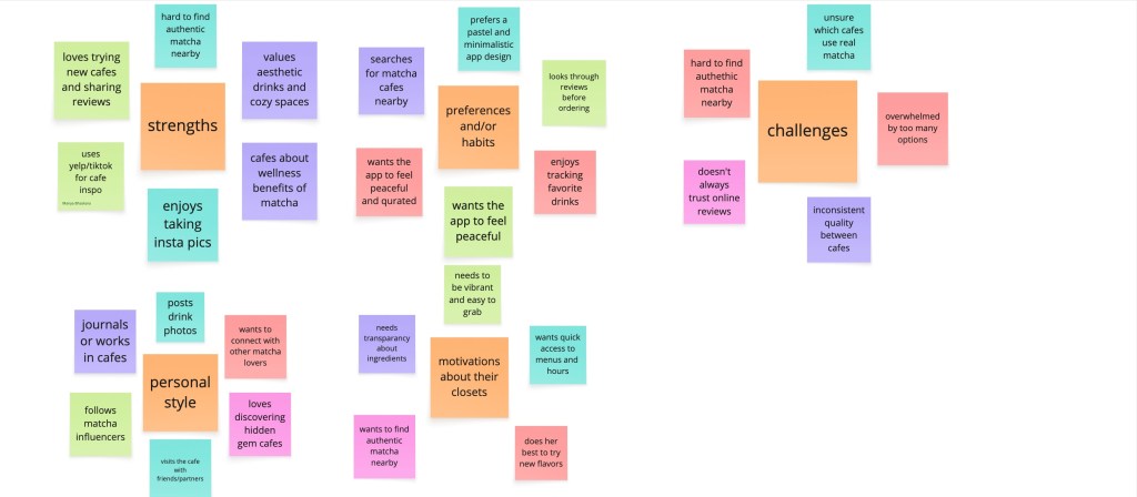
After gathering insights from participants, I created an affinity map to organize and group the key themes that emerged. The categories included pain points, motivations, behaviors, influences, and opportunities related to discovering authentic matcha cafés.
Empathy Map
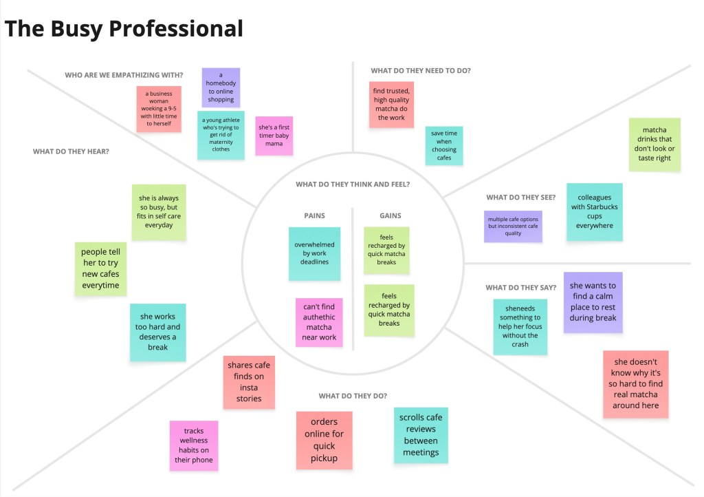
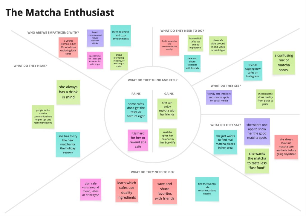
To better understand the matcha lover’s mindset, I created an empathy map summarizing what users think and feel, see, hear, and do during their search for authentic matcha. This helped highlight their frustrations, expectations, and motivations, guiding my design decisions throughout the project.
Personas
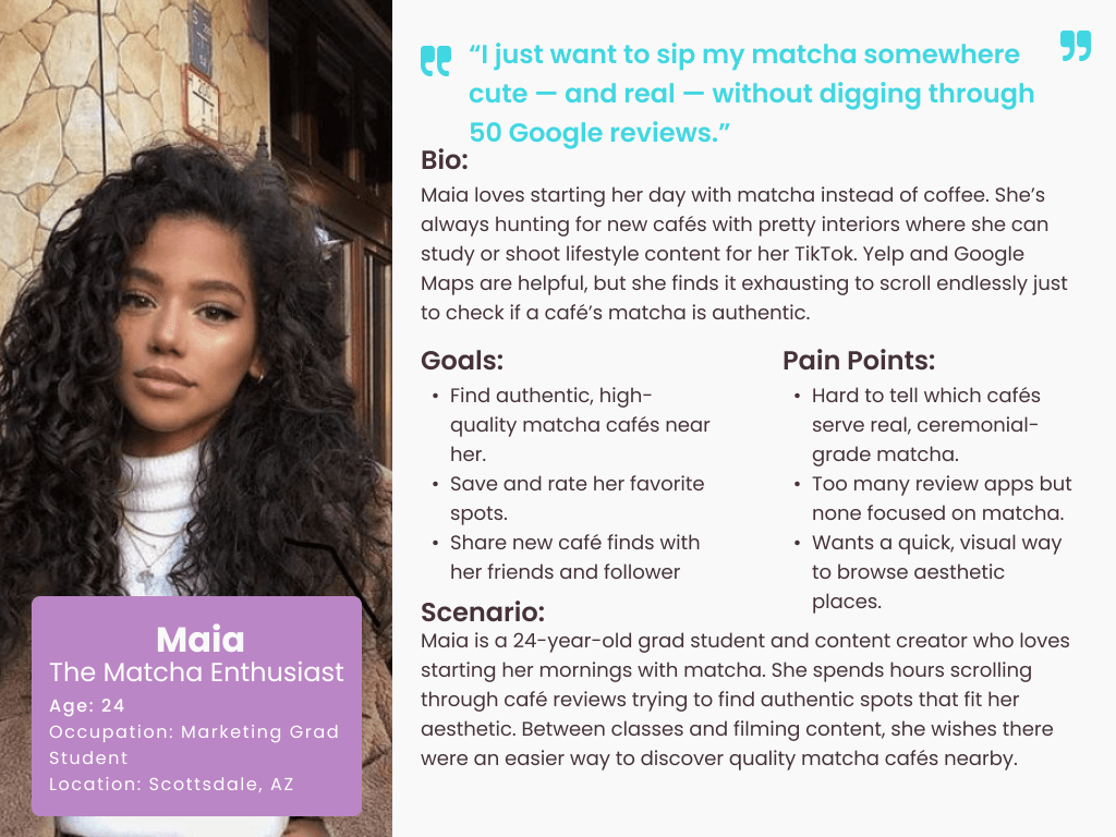
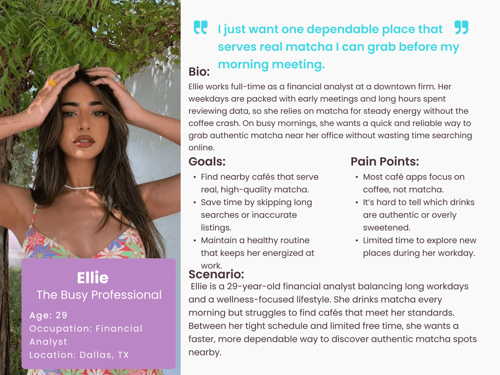
I created two primary personas based on user insights to represent the main audiences of Matcha Magic. These personas helped clarify user goals, frustrations, and expectations, ensuring the app stayed focused on solving real problems for matcha drinkers.
Ideations
How Might We’s
By consolidating my research, I created five key How Might We statements to guide the design of Matcha Magic. I wanted to explore how the app could make discovering authentic matcha easier, faster, and more personalized. If users had a dedicated space to learn about matcha, find verified cafés, and match drinks to their taste, the overall experience could feel more intentional, trustworthy, and fun.
- How might we help users quickly find authentic matcha near them?
- How might we reduce uncertainty around which cafés use high-quality matcha?
- How might we personalize recommendations based on users’ flavor preferences?
- How might we simplify comparing different cafés and drink options?
- How might we create a fun, engaging way to discover new matcha drinks?
Brainstorm
After creating the “How Might We” statements, I moved into the brainstorming phase. To avoid creative blocks, I used the Crazy 8s method to quickly generate a wide range of ideas. This helped me focus on rapid ideation instead of trying to find the perfect solution right away. The HMW statements guided my thinking and kept me centered on what users actually needed from a matcha-focused app.
Some of the ideas I sketched during this phase included: a “Matcha Personality Quiz,” an authenticity scoring system for cafés, a map view with quality filters, a feature to compare drinks side-by-side, and a favorites section for saving cafés and matcha types. These early concepts helped shape the features I refined later in the design process.
User Stories
The user stories highlighted major frustrations in the matcha discovery process and helped define the MVP for Matcha Magic — a focused, trustworthy way to find authentic matcha nearby. These stories reflect what real matcha lovers and casual users both need:
- As a user, I want to find authentic matcha cafés near me so that I don’t waste time visiting places with low-quality or overly sweet “matcha.”
- As a user, I want to view detailed drink information (grade, sweetness level, ingredients) so that I can confidently choose a matcha that fits my preferences.
- As a user, I want to compare cafés or drinks side-by-side so that I can decide where to go based on quality, authenticity, and reviews.
- As a user, I want to save my favorite cafés and matcha drinks so that I can revisit them easily.
- As a user, I want a personalized matcha quiz that recommends drinks based on my taste so that I can discover new matcha options I’ll actually enjoy.
- As a user, I want to see reviews and photos from other matcha lovers so that I can trust their experiences before deciding where to go.
- As a user, I want clear filters (ceremonial, sweet, iced, earthy) so that I can quickly narrow down options without scrolling through everything.
- These user stories shaped the core of Matcha Magic’s MVP and kept the design simple, purposeful, and aligned with user expectations.
Site Map
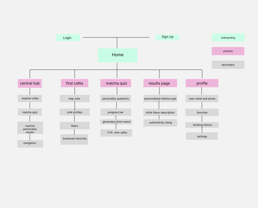
The first step in shaping Matcha Magic was creating a site map. This helped me visualize the overall structure of the app and understand how each feature connects to the user journey. By organizing the content early on, I made sure that key sections—like the home screen, matcha quiz, results page, café finder, and user profile—were easy to access and navigate. As the app evolved, the site map served as a guide to keep the experience simple, intuitive, and focused on helping users find authentic matcha quickly.
User Flows
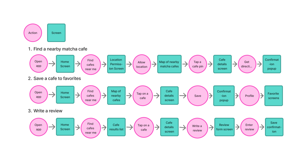
To understand the user journey, I created three key user flows that outline how people will interact with Matcha Magic. These flows helped ensure smooth navigation and highlighted the core features of the app.
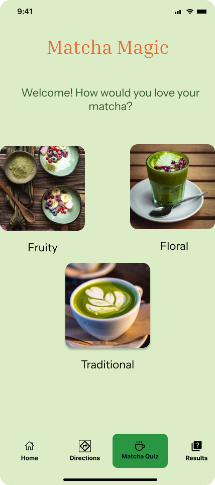
Flow 1: Taking the Matcha Quiz
This flow guides users through the quiz that reveals their “matcha personality.” It ensures users clearly understand each question, receive personalized results, and are directed toward cafés that match their preferences.
Flow 2: Finding a Matcha Café
This flow shows how users search for nearby cafés, apply filters (authentic, ceremonial grade, aesthetic, etc.), view café details, and save places to their favorites. It emphasizes the app’s goal of helping users discover high-quality matcha locations quickly and confidently.
Flow 3: Viewing & Saving Matcha Results
This flow outlines how users review their quiz results, explore recommended drinks, and see which cafés offer their matcha type. It also includes the option to save results or mark favorites, helping users build a personalized matcha profile.
Sketches
Before moving into wireframes, I sketched out each user flow to visualize how users would move through the app. These sketches helped me quickly map out the quiz screens, café discovery pages, and results layouts, making it easier to see whether each step felt intuitive. Sketching also allowed me to experiment with different layouts and identify the clearest pathways for helping users take the quiz, explore cafés, and save their matcha preferences. These early drawings served as the foundation for the low- and mid-fidelity wireframes that followed.
Designs
Wireframes
After completing my sketches, I translated them into low-fidelity wireframes to map out the structure of Matcha Magic. During this process, I realized I could streamline the quiz experience by removing a couple of unnecessary steps—an early example of how iterative design shaped the project. My low-fi frames used simple shapes and placeholder text so I could stay focused on layout, hierarchy, and the overall flow.
Once the layout felt solid, I moved into medium-fidelity wireframes, adding real labels, icons, and more defined components. This helped me spot areas where the experience could be clearer—like making the “Find Cafés” button more prominent on the results screen and improving spacing so users could focus on their matcha recommendations. The wireframes acted as a bridge between raw ideas and polished designs, ensuring that each screen supported a smooth, intuitive journey.
Moodboard
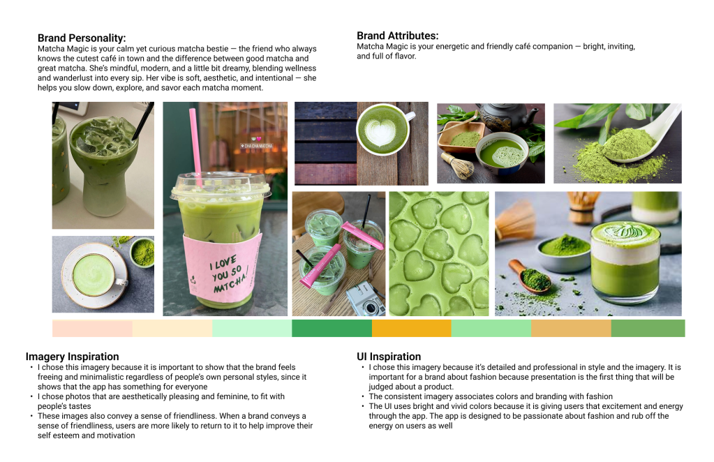
To define the visual identity of Matcha Magic, I created a mood board that captured the feeling and personality of the app. I chose a palette of soft greens, warm neutrals, and earthy tones to reflect the natural, calming, and authentic qualities of real matcha. These colors help communicate freshness, trust, and simplicity—values that align with the app’s focus on guiding users toward high-quality matcha experiences.
The imagery I selected highlights the serenity of traditional matcha, the craftsmanship behind preparation, and the aesthetic vibe of modern matcha cafés. Together, these elements create a brand personality that feels calming, authentic, refreshing, and warm.
I wanted the UI to echo this same atmosphere—clean layouts, gentle colors, and minimal clutter—so users feel relaxed and focused as they explore cafés or take the matcha quiz. Overall, Matcha Magic’s brand identity is designed to inspire curiosity, celebrate authenticity, and make discovering matcha feel like a peaceful and enjoyable ritual.
Style Guide
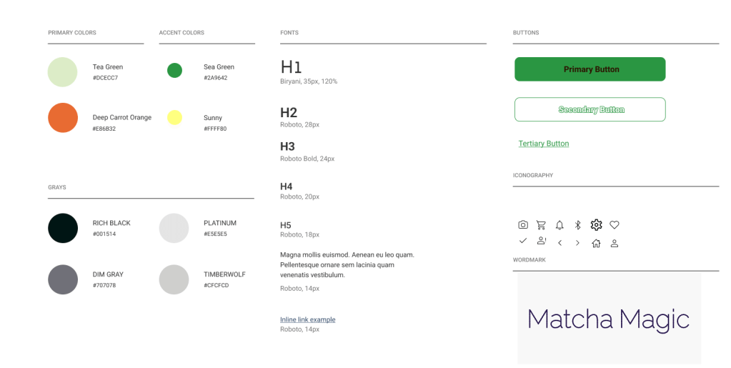
Creating a style guide helped me maintain consistency across Matcha Magic and make sure every screen felt cohesive. For typography, I chose Roboto because it’s clean, modern, and highly readable—perfect for an app that needs to feel both minimal and trustworthy.
For the color palette, I selected matcha-inspired greens paired with a warm, vibrant orange.
- The greens reflect authenticity, nature, and freshness—mirroring the calming qualities of real matcha.
- The orange adds warmth, energy, and a sense of friendliness, helping the app feel more inviting.
Together, the palette communicates calm, natural, refreshing, and approachable—perfectly aligned with Matcha Magic’s goal of helping users discover high-quality matcha in a way that feels simple, warm, and enjoyable.
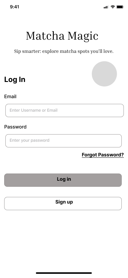
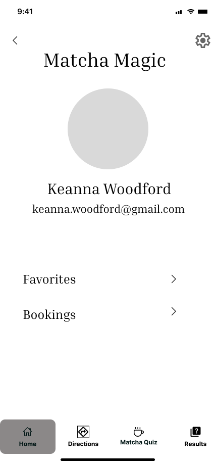
Hi-Fi Screens
Designing the Hi-Fi screens for Matcha Magic was an iterative process focused on balancing clarity, personality, and a calm matcha-inspired aesthetic. I refined the visual style using a fresh green palette paired with warm orange accents, creating a look that feels natural, energetic, and inviting—just like a real matcha café experience.
I organized each screen with intentional white space and clean layouts to keep the interface simple and easy to navigate. This helped ensure that users could focus on key actions like taking the matcha quiz, viewing results, and exploring authentic cafés without feeling overwhelmed.
As the designs evolved from mid-fi to hi-fi, I introduced real imagery, polished icons, shadows, and branded UI components based on my style guide. The updates added depth and personality while keeping the experience accessible. I also added small moments of delight, such as subtle animations or visual confirmations, to make interactions feel more enjoyable.
The final Hi-Fi designs represent a refined, cohesive system that reflects Matcha Magic’s identity—calm, fresh, and user-friendly—while supporting smooth navigation throughout the app.
Prototype
I used Figma to build an interactive prototype of Matcha Magic’s key red routes. Prototyping allowed me to see how each screen connected and to experience the flow just like a real user—from taking the matcha quiz to viewing results and discovering nearby cafés.
This step helped me evaluate clarity, ease of navigation, and overall usability. Seeing the interactions in motion made it easier to spot where transitions could be smoother and where buttons or labels needed refinement. Building the prototype reinforced the importance of keeping the experience simple, intuitive, and consistent, ensuring users can move through the app confidently and without confusion.
Test
Usability Testing
Usability testing was essential to ensure Matcha Magic felt intuitive, smooth, and aligned with what real matcha lovers need. I conducted five remote usability tests over Google Meet, recruiting participants through social media and selecting people who enjoy matcha, café-hopping, or using food-related apps.
The goal was to evaluate the core red-route tasks of the app, including:
- taking the “Which Matcha Are You?” quiz
- understanding the results and flavor profile
- finding authentic cafés nearby
- saving cafés or matcha types to their favorites
During each session, I observed how users navigated the prototype, paying attention to moments of hesitation, confusion, or friction. Their feedback helped me identify opportunities to simplify the quiz flow, clarify buttons and labels, and improve the visibility of the “Find Cafés” feature.
Overall, usability testing allowed me to refine the experience, tighten the navigation, and ensure that Matcha Magic feels easy, welcoming, and genuinely helpful for users searching for high-quality matcha.
Findings
During the usability testing, I observed several critical issues that provided insight into areas of improvement.
| Priority | Issue | Recommendation |
| Critical | Users were confused about where to start after logging in — some didn’t realize the “Which Matcha Are You?” quiz was the main feature. | Add a short onboarding pop-up or tooltip guiding users: “Take the quiz to find your perfect matcha!” |
| Critical | On the results page, users didn’t immediately understand how to locate cafés that serve their matcha type. | Add a clear button under results that says “View Cafés Serving This Drink” with a café icon for visibility. |
| Major | Users expected more visual feedback during quiz progress and weren’t sure how many steps were left. | Include a visible progress bar or “Question X of Y” indicator at the top of each quiz screen. |
| Major | Some users wanted to save their results to revisit later in their profile. | Add a “Save to Profile” or “Favorite This Matcha” feature on the results page. |
| Minor | Users wanted more personalization options in their profile, such as saving favorite cafés or drink types. | Include an editable “Favorites” section and allow users to tag preferences (e.g., floral, earthy, iced). |
| Minor | A few users mentioned wanting recommendations or matcha facts after getting results. | Add a “Matcha Tip” section or carousel with short facts like “Ceremonial grade = best for whisking.” |
Redesign
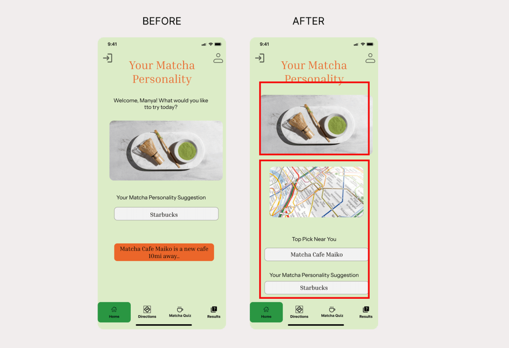
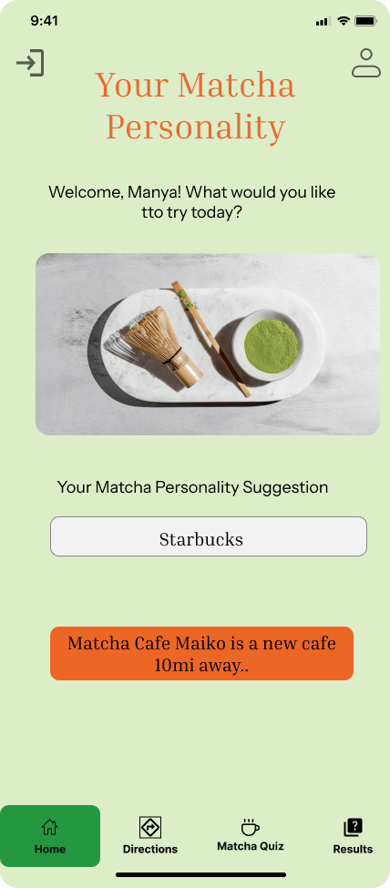
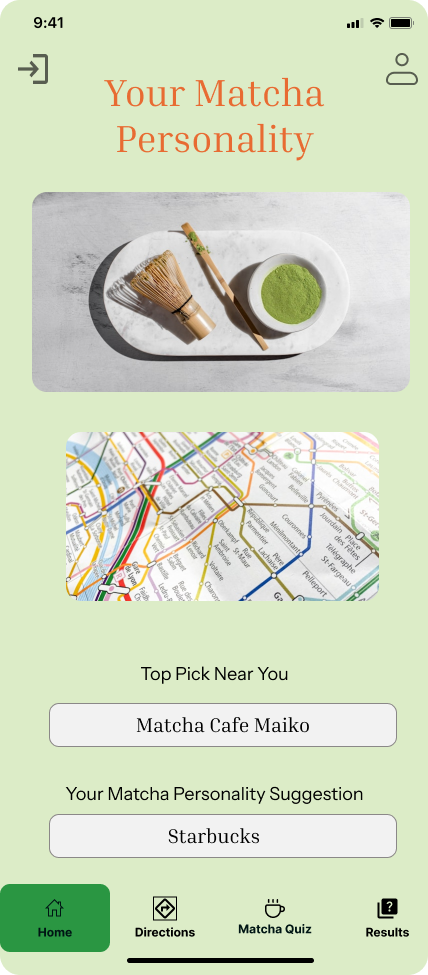
- Issue 1: No clear path from personality results to nearby matcha cafés.
- Before — Users enjoyed discovering their matcha personality, but many were confused about what to do next. The results screen only showed their matcha type, without offering a way to find cafés that actually serve that style of matcha. This left the experience feeling incomplete and disconnected from the app’s purpose.
- After — I added a clear call-to-action under the results section: “Find Cafés Serving This Matcha” along with a map preview and a dedicated button. This gives users an immediate next step, guiding them to explore authentic matcha cafés nearby that match their flavor profile.
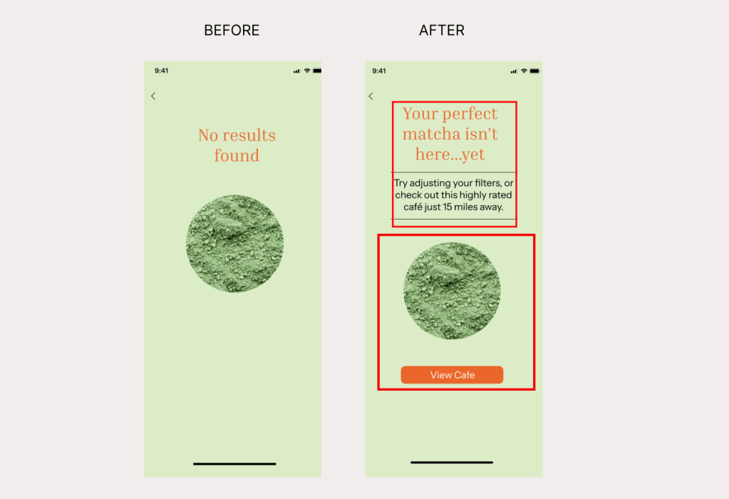
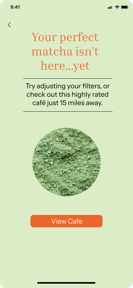
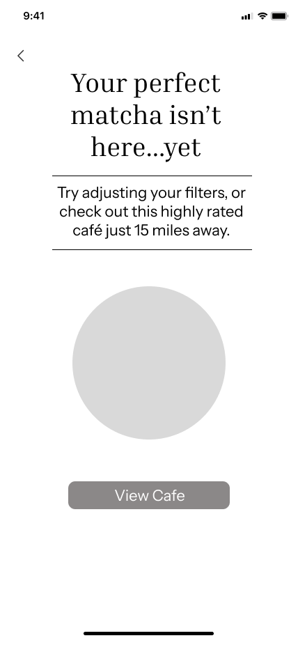
- Issue 2: Error Page Left Users Stuck With No Way to Continue
- Before —Users who reached the error page had no way to go back, retry, or explore other café options. The screen acted as a dead end, causing frustration and breaking the flow of the app.
- After —I redesigned the error page to include a clear “Go Back” button and added suggested cafés so users can quickly recover and continue exploring matcha options without feeling stuck.
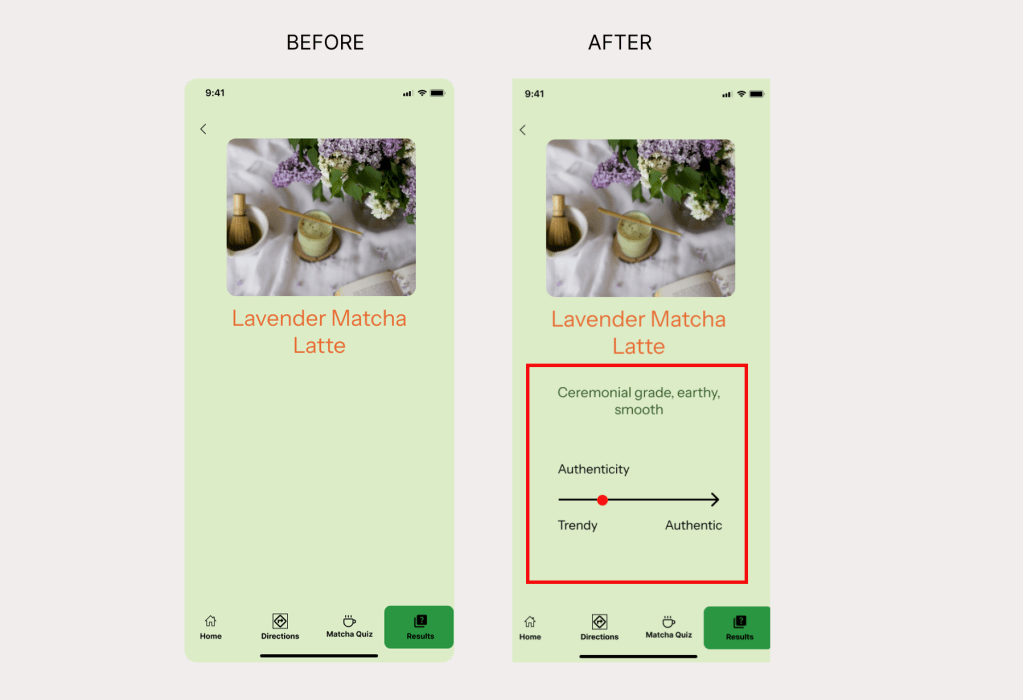
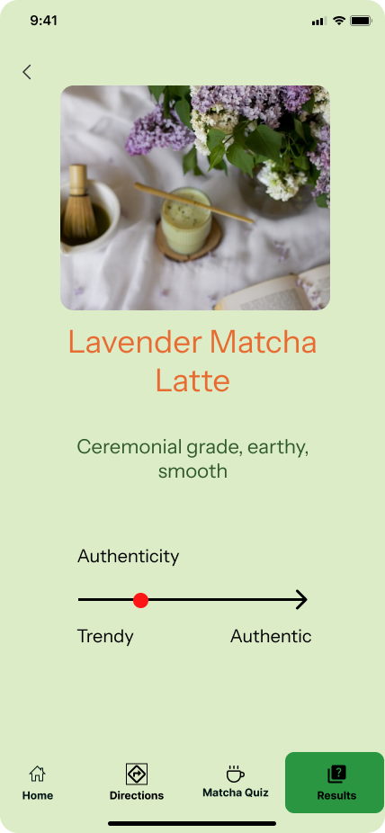
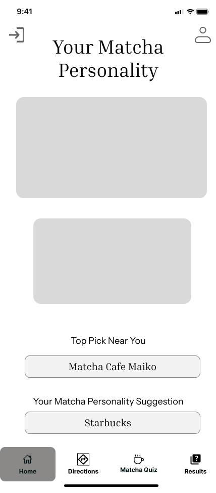
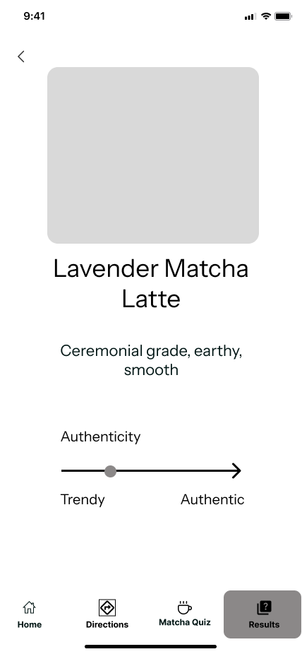
- Issue 3: Matcha Results Were Too Vague and Lacked Specific Details
- Before —Users said the results page wasn’t specific enough. It only showed their matcha personality without explaining the flavor notes, drink type, or why it matched them, leaving them unsure of what the result actually meant.
- After —I updated the results page to include clear flavor descriptions, drink recommendations, and personalized notes so users understand why they matched with that type of matcha and what to look for at cafés.
Reflection
Designing Matcha Magic has been an incredibly rewarding process that strengthened my skills as a UX researcher and designer. This project taught me the value of truly listening to users and letting their needs shape the product. By grounding decisions in real feedback, I learned how much more meaningful and intuitive a design becomes when it reflects actual user behavior rather than assumptions.
Throughout the project, I deepened my understanding of user-centered design, iterative problem-solving, and the importance of testing early concepts. Participants pushed me to think beyond my initial vision—for example, suggesting features like saving favorite cafés, adding matcha education, or creating a clearer way to compare matcha types. These insights expanded the app’s potential and helped me refine the experience into something more helpful, authentic, and engaging.
Overall, building Matcha Magic allowed me to grow as a designer who prioritizes clarity, empathy, and simplicity. It reaffirmed that thoughtful design is always shaped by users, and that the best solutions come from staying curious, open, and adaptable.
