
A virtual closet app that empowers users to digitalize their wardrobe, collaborate with friends, and shop more consciously
Overview
In today’s fast-paced, style-driven world, people are overwhelmed by cluttered closets, uninspiring wardrobes, and the pressure to keep up with ever-changing fashion trends. Despite the rise of sustainability and thrifting, most digital wardrobe tools feel outdated or overly complex or lack community-driven features that make fashion fun again.
This inspired me to design a solution that merges personal style management with social connection. My virtual closet app empowers users to digitize their wardrobe, explore curated thrift and trend finds, and collaborate with friends to share, swap, and shop more consciously. The app not only reduces decision fatigue and fashion waste—it redefines how people connect through style.
Project Duration:
16 weeks
My Role:
UX/UI Designer
Tools used: Figma, Zoom, FigJam
The Challenge
In today’s fast-paced, fashion-driven world, many people struggle to find all of their everyday wardrobe essentials or fashion inspiration in one convenient place. Closets are often cluttered with items that no longer suit their style or fit, and the growing interest in sustainable fashion drives people to thrift shopping. However, the process of finding quality, unique pieces can be overwhelming and time-consuming. Additionally, individuals miss out on sharing their fashion discoveries with friends, leading to missed trends and a lack of social, collaborative shopping experiences.
The Solution
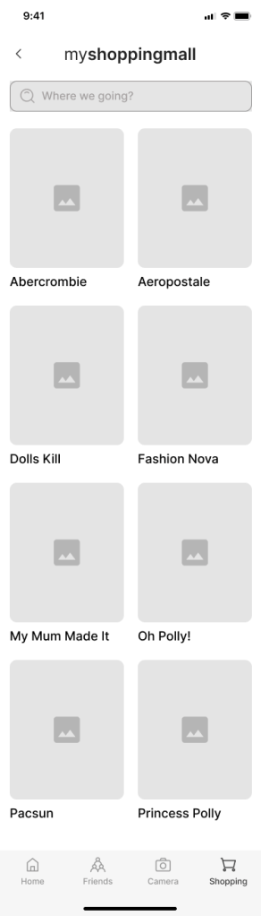
MyCloset helps users effortlessly organize, discover, and share outfits while creating a seamless, enjoyable fashion experience. It’s a solution for people looking to streamline their wardrobe management while staying on top of current trends. The app offers the following features:
- Streamlined wardrobe organization that allows users to easily add, categorize, and manage clothing items, helping them organize their closet digitally.
- Collaborative sharing where users can share their wardrobes with friends, exchange outfit ideas, and inspire one another to create fresh looks.
- Personalized outfit recommendations based on users’ existing items, moods, and occasions, making it easier to discover new ways to wear what they already own.
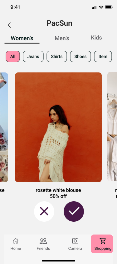
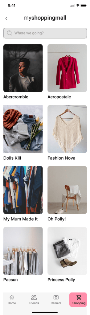
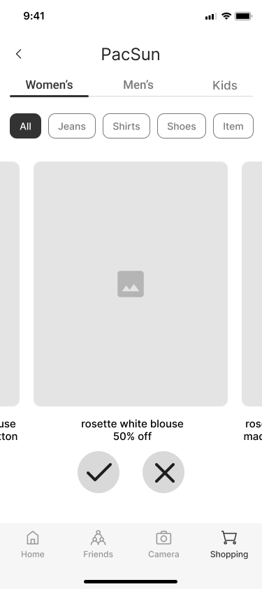
- Integration with thrift and new fashion discoveries, allowing users to explore and add unique, stylish pieces to their digital closet.
- Seamless planning tools to help users plan outfits for specific events or days, saving time and reducing decision fatigue.

Discovery
I conducted secondary research to understand the challenges users face in managing their wardrobes digitally and how existing apps handle wardrobe organization. I reviewed fashion tech blogs, user behavior articles, competitor app reviews (like Stylebook and Smart Closet), and online reports on clothing organization habits. My goal was to uncover key trends around daily outfit planning and wardrobe usage. Some key findings included:
- Cluttered user interfaces: Many closet apps overwhelm users with complex navigation, making it difficult to quickly and easily add new items or plan outfits.
- Limited customization options: Many apps fail to allow users to personalize their closet, which can create frustration when users can’t categorize their clothing in a way that suits their needs.
- Decision fatigue: Users struggle to choose outfits, especially when they have too many options and no streamlined system to help them easily identify what to wear.
- Lack of social interaction: Many closet apps don’t encourage social sharing or collaboration, which can make the experience feel isolating instead of convenient and engaging.
- Time-consuming processes: Users are looking for apps that save time by allowing them to efficiently organize their wardrobe, plan outfits, and access their closet quickly.
Primary Research
I conducted primary research to gather first-hand insights, specifically from women who love fashion. To do this, I conducted a 10-minute survey that allowed me to gather feedback from participants. The goal of the survey was to understand:
- Pain points and barriers in organizing their wardrobe and planning outfits.
- How they currently manage their closet, and the challenges they face in terms of convenience and style satisfaction.
- What features they’d like in a digital closet app to make the process easier, more fun, and more organized.
I created a screener survey to target 16-29 year old women who are passionate about fashion, and I recruited five participants from my personal network, social media, and fashion communities. 80% of my participants were from somewhere colder so they did not care about styling that much. This approach ensured I was getting relevant insights from people who would actually benefit from the app.
Synthesis
Affinity Map
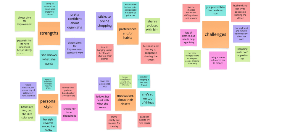
After gathering data from the participants I made an affinity map to organize and categorize the key notes taken. The five categories were strengths, challenges, personal style, preferences/habits, and motivations about their closets.
Empathy Map

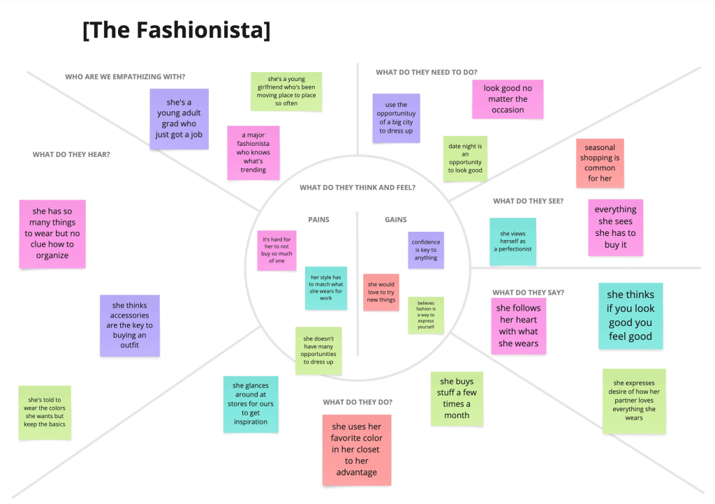
I then created empathy maps to identify the unique types of users that I will be designing for. These maps identified what the users do, think, feel and say. In this process I discovered two unique user types, the married mom and the fashionista.
Personas

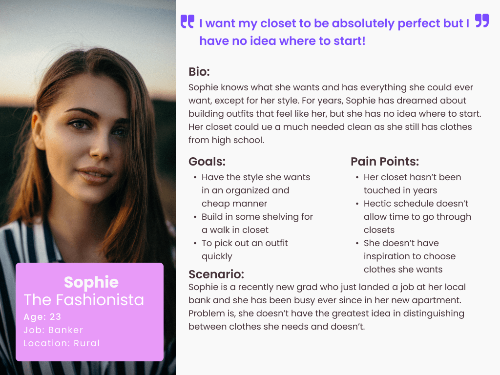
Based on the empathy maps I created two personas in order to ensure the decision making process will be user centered throughout the project. While creating solutions I would refer back to these personas for guidance.
Ideations
How Might We’s
By consolidating my research, I created five key How Might We statements to keep me focused throughout the design process. I wanted to explore how MyCloset could offer a more efficient and enjoyable way to plan outfits and manage wardrobes—especially for fashion-forward users with busy schedules. If there were a more seamless way to visualize, style, and access your closet from anywhere, then outfit planning could become quicker and more fun, which could help users feel more confident and intentional in their daily fashion choices.
- How might we simplify the process of sorting through clothes
- How might we help people become aware of clothes that they haven’t worn in a while?”
- How might we consider our living situations when people have different amounts of space than others?
- How might we visually view our closet outside of the house?
- How might we get creative with picking out outfits?
Brainstorm
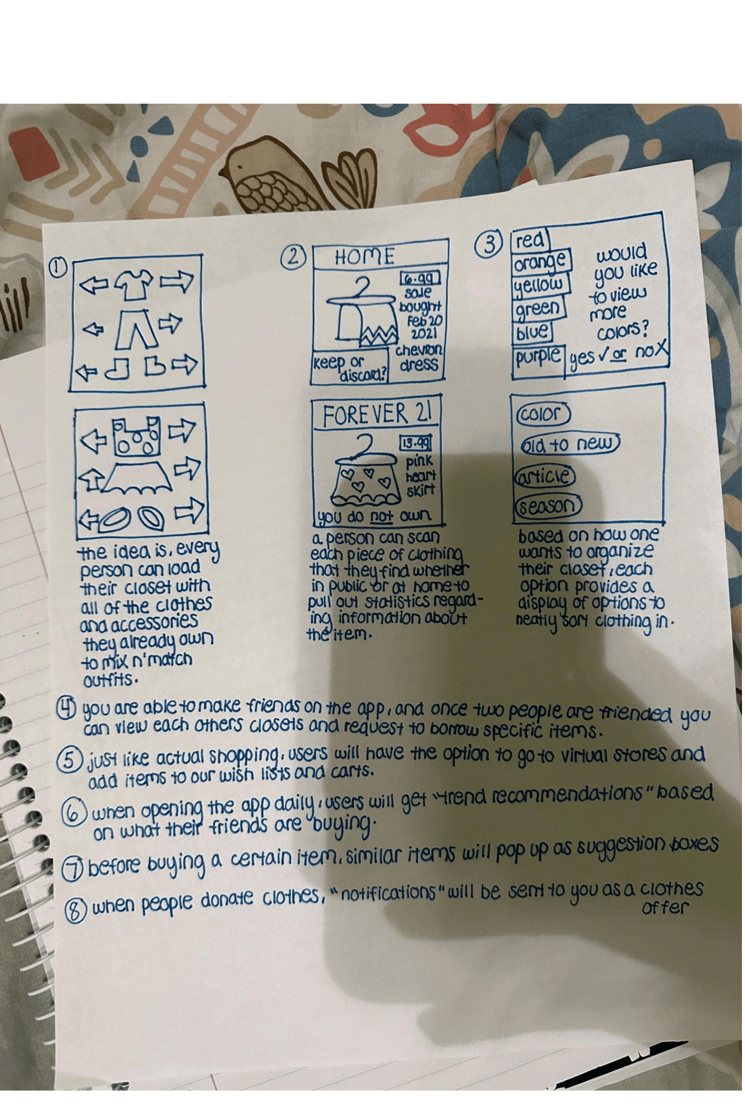
After creating “How might we” statements, I brainstormed. I wanted to avoid creative blocks during the brainstorming phase, so I used the Crazy8 method to quickly generate a variety of ideas. This method helped me focus on ideation without overthinking the perfect solution right away. By using How Might We (HMW) statements, I was able to guide my thinking in the right direction without getting stuck on one concept. To keep the creative flow going, I reminded myself not to judge the ideas too harshly during this stage. Some of the concepts I explored included integrating a personality-based style quiz, adding a feature for virtual try-ons, a “mood-based outfit suggestion” tool, a social feature for sharing outfits with friends, and incorporating a calendar to track outfit planning. These initial ideas laid the foundation for more refined concepts during the later stages of development.
User Stories
The user stories revealed critical pain points, identified high-priority elements, and shaped my MVP (Minimum Viable Product), which drastically differs from current closet and wardrobe apps:
- As a user, I want to easily organize and manage my wardrobe so that I can keep track of my clothes and avoid clutter in my closet.
- As a user, I want to discover new outfit combinations based on the items I already own so that I can easily create fresh and stylish looks without buying new clothes.
- As a user, I want to browse and share clothing items with my friends’ closets so that I can see what they have and maybe borrow or swap items.
- As a user, I want to shop for new or thrifted clothing directly from the app so that I can easily add new pieces to my closet without leaving the platform.
- As a user, I want personalized style recommendations based on my wardrobe so that I can stay on top of trends and make the most of my existing clothes.
- As a user, I want to plan and organize outfits for different occasions using a calendar view so that I can save time and reduce decision fatigue when getting dressed.
Site Map
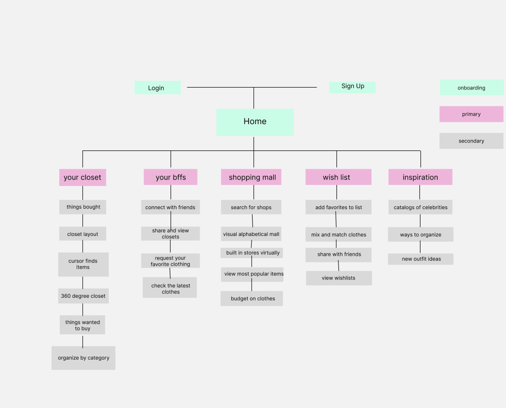
The first step in turning my ideas into an app was creating a site map. This allowed me to visualize the structure of the app and understand how each feature would be connected. By laying out the app’s content, I could ensure everything was logically grouped for easy navigation. The site map helped organize sections like the home page, closet, outfit planning, mood-based suggestions, and the shopping section, ensuring that users could easily find and access all the features. As more features and functionalities were added later, the site map served as a guide to maintain a cohesive structure throughout the app’s development.
User Flows
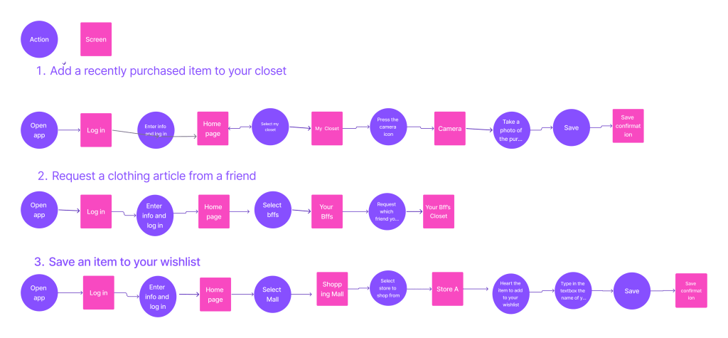
To understand the user journey, I created 3 distinct user flows that highlight how users will interact with the app. These flows are designed to ensure smooth navigation and emphasize the key functionalities of the app.
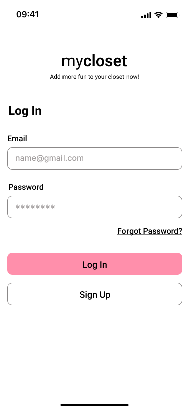
- Flow 1: Signing up and logging into the app
This flow allows users to create an account or log in to access the app’s features. It ensures that users can quickly get started and secure their personal information. - Flow 2: Adding items to the digital closet
This flow guides users through the process of uploading items to their virtual closet. It includes steps like taking photos, categorizing the items, and saving them to the closet, which forms the core functionality of the app. - Flow 3: Browsing and creating outfits
This flow shows how users can browse their closet, search for new items, and create outfits. Users can experiment with different combinations and receive style suggestions to enhance their wardrobe and streamline outfit planning.
Sketches
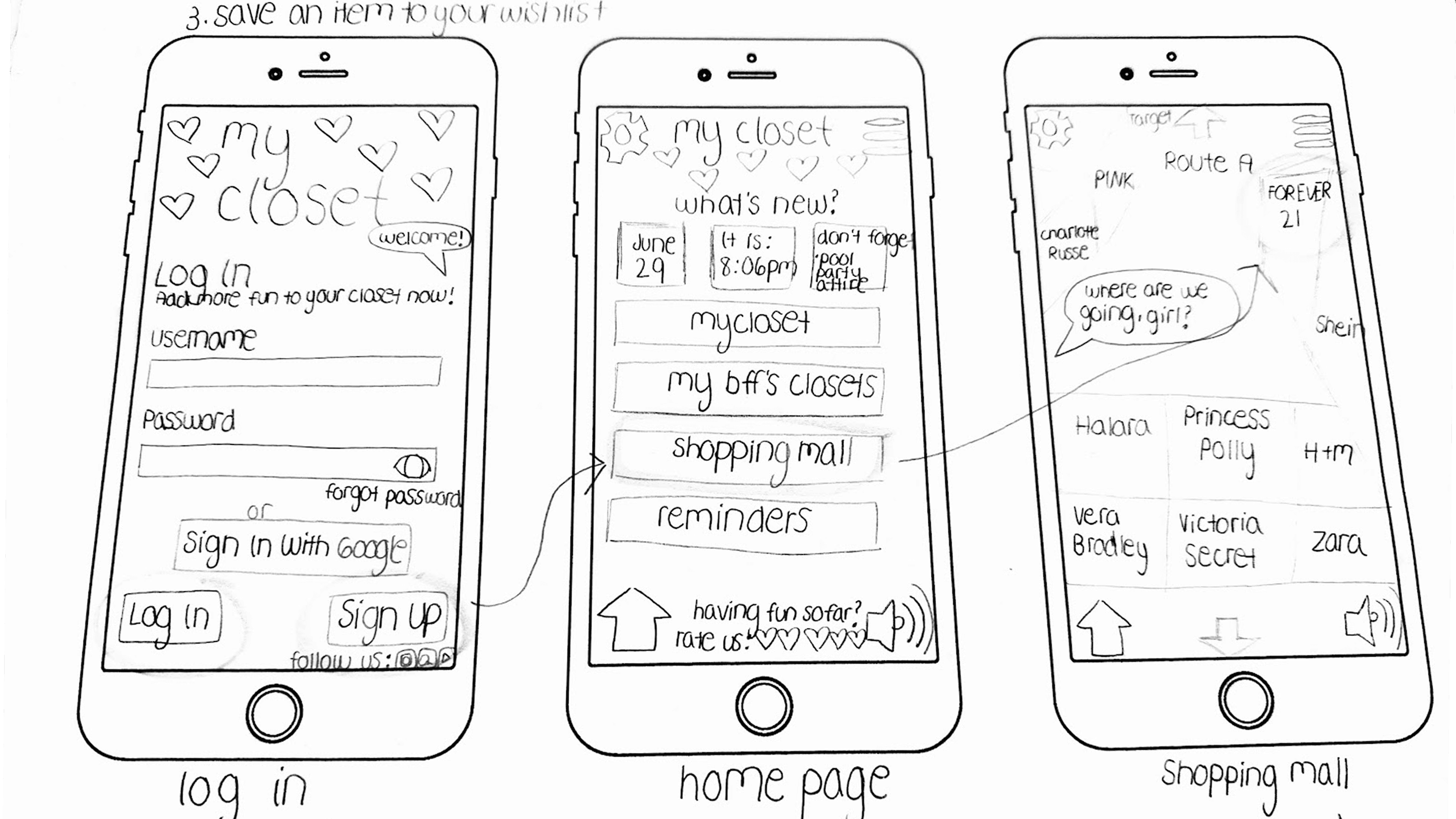

I took the user flows and added a visual aspect to it in the form of sketches to really see how intuitive the flows were. This helped me envision the pathways needed to get users going on a date in a straightforward process as well as understand the actions and decisions available to the user. I used these sketches for inspiration to create the wireframes.
Designs
Wireframes
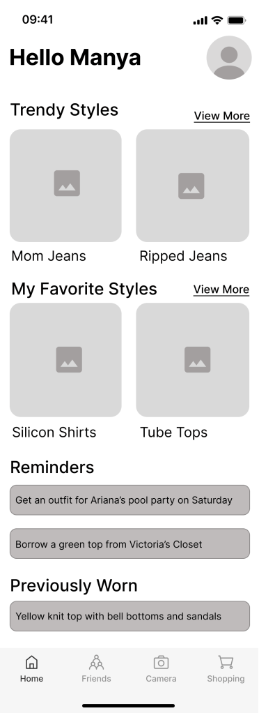
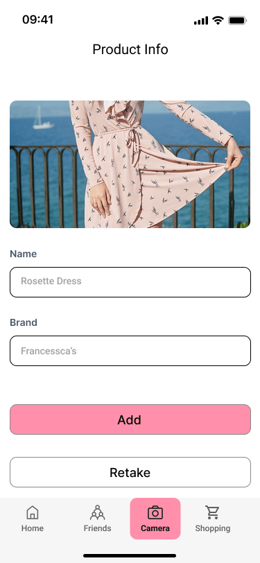
I turned my initial sketches into wireframes and quickly discovered I could simplify the first user flow by removing two unnecessary screens—an early sign of iterative design in action. My low-fidelity frames used placeholder text and imagery so I could focus on layout, spacing, and overall user flow. As I transitioned into medium-fidelity wireframes, I introduced real labels, icons, and images, which helped me spot areas where the experience could be more intuitive. I re-evaluated screen hierarchy and content placement to ensure users could easily navigate and find value in the app. For instance, the “Closet Item Details” screen evolved to prioritize outfit inspiration and styling options first, with metadata like brand and size shown second—supporting users in their main goal of effortlessly planning what to wear.
Moodboard
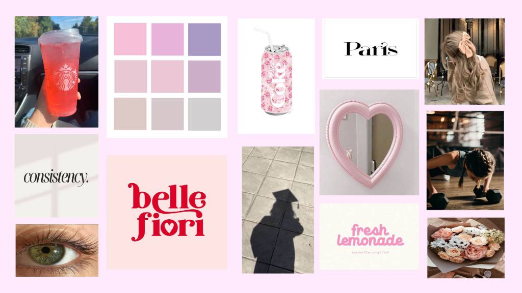
To better understand the flavor and personality of mycloset, I created a mood board and defined the brand’s personality. I chose a soft pink and pastel color palette because it reflects the approachable, fun, and calming atmosphere that I want the app to convey. The use of soft pinks evokes a sense of warmth and femininity, aligning with the trendy and fashionable nature of the app. The pastel tones bring in an element of subtlety and serenity, making the interface feel light and easy to navigate.
I selected images that highlight a sense of personal expression, individuality, and the joy of finding new outfits without the stress of decision fatigue. The UI design is intended to reflect the same peaceful and stylish aesthetic, offering a welcoming space for users to explore and organize their wardrobes. The overall look and feel of mycloset is meant to inspire creativity, offer a sense of calm, and make the process of managing a wardrobe feel like a fun, engaging, and stress-free experience.
Style Guide
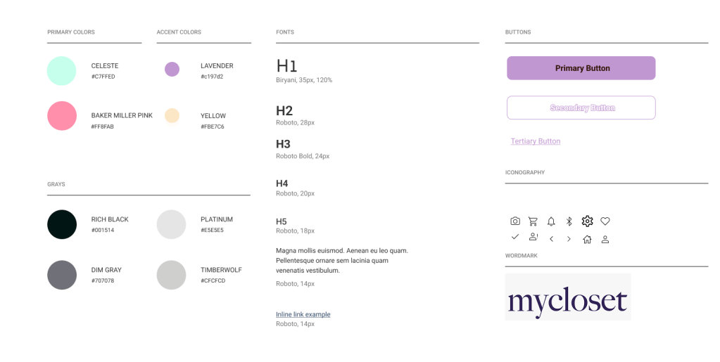
Creating a style guide helped me streamline the design process and ensure visual consistency throughout the app. For the font, I chose Roboto for its clean, modern appearance and excellent readability, making the app feel accessible and user-friendly. To give the app an inviting, playful feel, I selected a color palette that includes pink, orange, yellow, and aqua. The pink creates a warm, welcoming atmosphere, while the orange adds a sense of energy and fun. Yellow brings a touch of optimism, and aqua balances the palette with a calming, refreshing vibe. Together, these colors evoke a sense of positivity and approachability, perfectly complimenting MyCloset’s goal of offering users a delightful and engaging digital wardrobe experience.
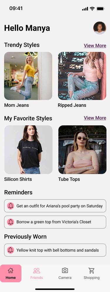
Hi-Fi Screens


Creating the Hi-Fi screens was a thoughtful process that involved multiple iterations to find the right balance between functionality and style. The design aimed to be vibrant and inviting, using a combination of pinks, oranges, yellows, and aqua to convey a playful yet trendy feel while ensuring the colors were visually appealing and accessible to a wide audience. I focused on organizing each screen to be clean and easy to navigate by strategically using white space and adjusting vertical scrolling to avoid overwhelming users. The images on the screens were chosen to highlight outfits and clothing categories, rather than the individual, reflecting the app’s focus on fashion. Additionally, to encourage user interaction and make the experience more engaging, I incorporated fun elements like celebratory animations (such as confetti) in success modals when users completed key actions, adding an element of joy and motivation. The style guide maintained consistency across design elements, including typography, colors, imagery, and layout. Transitioning from medium-fidelity to high-fidelity designs, I refined visual elements according to the style guide and incorporated additional details like images and shadows to give the design a polished look.
Prototype
Test
Usability Testing
Usability testing was a crucial step in ensuring that the app would be intuitive and meet the needs of its users. I conducted five remote usability tests via Google Meet, recruiting participants through social media. The participants were selected based on their experience with fashion apps or online shopping and their openness to trying a new approach to wardrobe organization. The goal was to test the core tasks of the app: adding items to their closet, browsing and searching for fashion pieces, and creating outfits. During the sessions, I closely observed users as they interacted with the app, noting any difficulties or frustrations they encountered. This allowed me to identify areas where the design could be improved, refine the user flow, and ensure that the app’s key features were user-friendly and functional.
Findings
During the usability testing, I observed several critical issues that provided insight into areas of improvement.
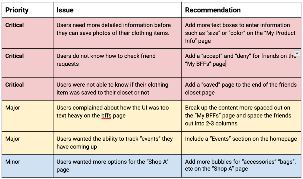
Redesign
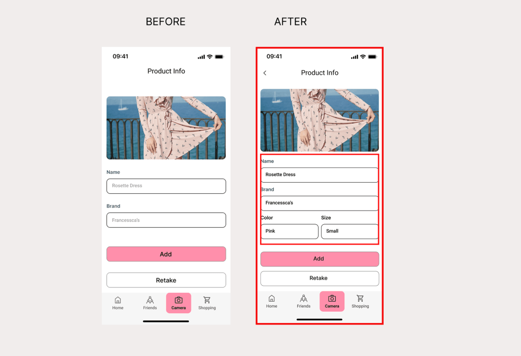
- Issue 1: Improved Product Info Labels for Clothing Details
- Before – Users pointed out that the labels for “Name” and “Brand” were not descriptive enough to describe the piece of clothing that they wanted to save.
- After – Adding more labels to “Product Info” to be more descriptive such as “Color” and “Size”
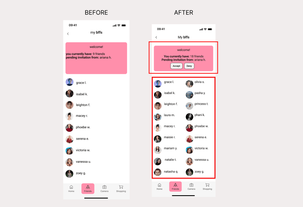
- Issue 2: Improved Friend List Layout with Action Labels
- Before – Users did not like how all of the friends were on one column instead of two and looked chunky to them without knowing how to get more friends
- After – Added labels such as “Accept” and “Deny” while having two columns for friends
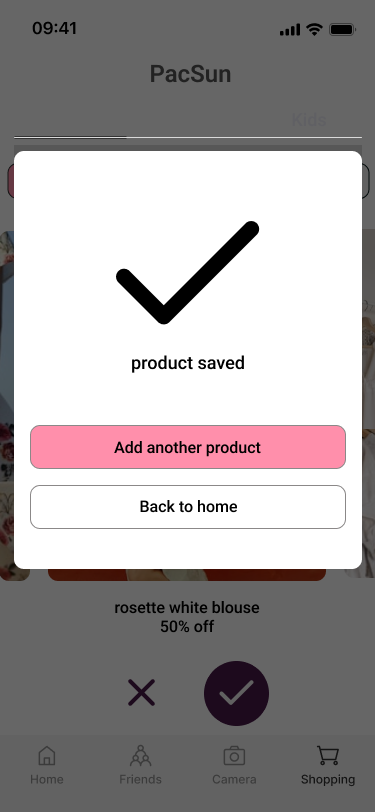
- Issue 3: Improved Feedback After Saving Items
- Before – 20% of users thought that they had no way to check if the sweater they wanted was saved. They would just click on it without knowing if they did the right thing
- After – Add a “product saved” to the page after so that users feel that sense of confirmation
Reflection
This journey has equipped me with valuable skills and insights that will shape my growth as a UX/UI professional. Through the process of designing MyCloset, I’ve gained a deep understanding of user-centered design and the importance of user feedback in shaping meaningful experiences. The app is built around users’ needs, and I’ve learned that listening to them can open up possibilities that expand beyond the original concept. For instance, feedback suggesting features like social sharing and collaborative closets has pushed me to rethink the app’s scope, making it more inclusive and aligned with real user behavior.
